































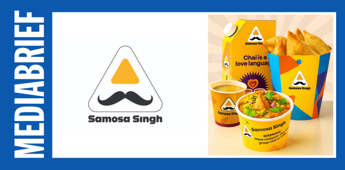
Quick-service restaurant chain Samosa Singh, known for its authentic and flavorful samosas, has unveiled a refreshed brand identity that includes a new logo, revamped menu, and a renewed focus on delivering snacks that are healthier, tastier, and crispier than ever. The rebranding marks a significant step in the company’s evolution as it looks to appeal to modern consumers while staying true to its street-food roots.
At the heart of the new identity is a sleek, contemporary logo that reflects Samosa Singh’s commitment to quality and innovation. Designed to evoke the perfect crunch in every bite, the updated visual language signals the brand’s shift toward a more polished yet approachable experience—without compromising on taste or tradition.
The new menu is an absolute blend of tradition and innovation—crafted to appeal to Gen Z’s adventurous palate while still being nostalgically loved by millennials. It is a much- needed evolution to stay ahead in today’s fast-changing food ecosystem, where being relevant means being rooted yet refreshingly different.
The brand is redefining indulgence by incorporating better-for-you ingredients and mindful cooking methods, without compromising on the flavours their customers love.
The new logo is designed to be modern, consistent, and globally appealing. The bolder moustache is a proud nod to their roots and personality, while the cleaner lines and new typography makes the logo more universally readable. The refined aesthetics elevate the brand, aligning with a more upscale and health-conscious market.
The updated logo design ensures they remain relevant in a competitive food and retail market, while the brand consistency across packaging, digital platforms, and merchandise reinforces their identity.
To appeal to the younger generation, the brand has introduced special packaging that’s vibrant, Instagrammable, quirky and made from high-quality materials. This packaging is designed to resonate with Gen Z’s love for visually appealing and sustainable products, making Samosa Singh a perfect fit for attracting new generation and environmentally conscious consumers.
Nidhi Singh, Co-founder, Samosa Singh, said, “As founders, this moment is incredibly special for us. We are excited to unveil not just a new look and menu, but a renewed commitment to what Samosa Singh truly stands for food that is healthier, tastier, and crispier, without losing its soul.
“Samosa Singh refreshed look is a reflection of our journey, our learnings, and our promise to keep evolving with our customers. It marks a new chapter driven by innovation, rooted in quality, and powered by the love and trust of those who’ve been with us from the start,” Singh added.
Shikhar Veer Singh, Co-founder, Samosa Singh, said, “At Samosa Singh, we’ve always believed in reimagining Indian street food with a fresh perspective. This change isn’t just cosmetic — it is a bold step towards building a brand that is more thoughtful, relatable, and future-ready.
With a strong focus on sustainability, aesthetics, and storytelling, we are confident that our refreshed identity will strike a chord with both loyal fans and a new generation of snack lovers,” Singh added.